An Outdated Bathroom Becomes a Light-filled Retreat
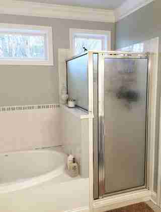
A master bath should be a place of serenity—especially when you have three children under the age of three. Even though this two-story traditional-style house in Knoxville, Tennessee, was built in 1998, the bath was already outdated, with a very small shower and fixtures that were falling apart. “The only thing the space had going for it was a line of transoms letting in a flood of light,” says local designer Natalie Clayman , who decided to gut the whole room and start from scratch. To create a bright, soothing bath, she kept to the same small footprint but borrowed space from a closet to make a larger shower, brought in modern materials, and introduced distinct but open areas. Here’s how Clayman’s thoughtful design gave a basic bath new life.

The transoms along the length of the wall provided light and privacy. “Having a half wall that didn’t go up to the ceiling to separate the tub and water closet was my client’s idea,” says Clayman of the divider, which allows light to move around the space.

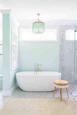
The original bathtub was a large drop-in with a tub surround. “It took up so much space,” says Clayman. “Replacing it with a Barclay freestanding tub opened up the room and was a game changer.”

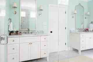
To create a fresh and bright look, Clayman placed tall mirrors from Worlds Away opposite the transoms to reflect light. Sherwin-Williams ’s Dewy paint on the walls brings in a tranquil feel.
The large scale of the mosaic tile creates the illusion of a space, while a tall wainscot in the shower gives the room balance and proportion. Clayman used a curbless shower for its clean lines and modern aesthetic.
Your comment