Inside a Melbourne Home That’s a Modern Twist on a Cuckoo Clock
What do you get when you take inspiration from a cuckoo clock, Japanese architecture, and the charming qualities of historic Edwardian-era homes? The latest residential project from the geniuses at Rara Architecture . Nicknamed Cuckoo House after its clocklike form, this two-bedroom, two-bathroom home in Footscray, Australia, a neighborhood right outside of the Melbourne city center, is a prime example of taking a dated home and transforming it into something new and exciting, while still celebrating the fabric of the existing structure.

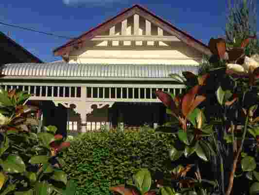
BEFORE: The original structure had a classic Edwardian cottage with a small layout, including one dark bedroom at the front, a gabled roof, a weatherboard exterior, and a surrounding veranda. In the update, Wesley moved the veranda farther out, managing to bring more natural light into the front bedroom.
“Footscray has been slowly undergoing a lot of gentrification over the last two decades,” says architect Wesley Spencer. “And with its proximity to so many restaurants and shopping, property values have skyrocketed.” But homeowners Nathan Smith and Iman Hasan knew their lot would be worth quite a bit someday and jumped at the chance to live in the bustling suburb.
Built in the early 20th century, the home was a classic Edwardian cottage with a small layout, including one dark bedroom at the front, a gabled roof, a weatherboard exterior, and a surrounding veranda. And while the couple fell in love with the home's historic qualities, they were in need of more space. The home also needed some major structural improvements. “You could see between the floorboards and see the dirt under the house,” Wesley says.

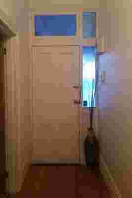
BEFORE: While not in the worst shape previously, the home was in need of some major structural improvements.

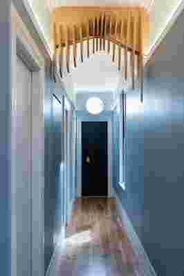
AFTER: The hallway is painted a light blue that continues into a front bedroom—this is where Nathan and Iman’s families will stay when they come to visit.
At first, the couple asked the architect for a back addition, typical in Australian remodels, but due to the amount of reconstruction needed, the builder determined it would be more cost-effective to just demolish the original house . It took a lot of convincing, but they ended up agreeing to an entirely new house, one that stayed on budget and was in line with the neighborhood character standards.
All of the homes on the street were built in the early 1900s, and thus this new design had to incorporate nods to the original historical elements. Modern design was fine with the neighborhood council, but it couldn’t be a jarring difference, something that actually proved to be quite the challenge during the initial design.
BEFORE: The project was completed in just eight months.
AFTER: The front hallway features skirting boards and and an elaborate ark tray.
“The first drawing came up too modern,” Wesley recalls. “We had just 24 hours to provide something they’d accept or go through another six-to-seven-month process.”
One of those specific historic details the council requested was a veranda—or something resembling one, at least. A lot of houses in Australia have them, but they shade the front windows, causing that first bedroom in an Edwardian layout to be dark. “That style was common and established when the first settlers came because it was so hot,” he says. “Then they continued to build that way in Melbourne.”
The ladder beside the kitchen leads to a lofted storage/office space.
The light and bright open-concept kitchen and dining area makes the home feel bigger.
The living room wall was originally meant to be covered in plywood, but Wesley went with a bright orange instead to “drag you into the space and make you feel welcome,” he says.
In order to appease the council, keep the inside light and bright, and give the homeowners the extra room they desired, he decided to keep the general floor plan the same and add a lofted storage/office space. The new entryway is covered in a light blue paint and clad in timber, tying into the tranquil front bedroom, and then the home opens up to a beautiful, color-filled living space, including a bright orange back wall, a lofted mezzanine, and an open-concept kitchen.
For the master bedroom, which was always going to be dark due to a lack of a window, Wesley came up with a clever hack, one that is often utilized in ancient tombs and chapels. “By painting the walls dark, it absorbs light, dark, and the shade, so the eye doesn’t realize the room is dark,” he says. The gold chandelier above the bed mimics the stars in the night sky.
The master bedroom is meant to feel quiet and peaceful and be a place to get away.
“Pharaohs’ tombs are always a dark blue with golden stars to resemble the night sky,” Wesley says, regarding the bold color choice.
And while the home is a significant departure from how it once looked, it still fits perfectly within its historic surroundings, and is an excellent play on modernism with unique details that make it a very special space.
“Nothing about this project pretends to be old,” Wesley says. “It’s just a modern interpretation of what was there.”
Your comment